Medicine Delivery Mobile App
Company
Service
About
Kurando was a German startup focused on the delivery of medicines and pharmaceutical products. Its vision was to simplify access to medicines by allowing customers to order them conveniently from home.
As a UX/UI designer, I was tasked with designing an app from the ground up that would competitively address the offerings of existing online pharmacies and delivery services.
Problem 💡
Kurando did not have an existing digital platform, which presented a challenge to build a robust solution from scratch. However, this situation also gave us the freedom to design features that would improve the user experience and fill gaps in the market.
Goals🎯
- User experience: create a simple and accessible interface for a wide range of users
- Efficiency: Minimise the complexity of the medication ordering process.
- Competitive Advantage: Implement features that would significantly improve user convenience, such as order tracking and prescription reminders.
Proces
Competitive Benchmarking
For the competitive benchmarking, I undertook a comprehensive analysis of competitors in the industry. This involved studying and evaluating their apps to identify their strengths, weaknesses, and unique features. I did a comparative study with the MYAD app because it was considered the industry leader in Germany. By conducting this rigorous competitive benchmarking analysis, I gained a deep understanding of the competitive landscape, identified areas for improvement.
We identified key areas that helped us set the strategy:
- Competitive strengths: Easy navigation and well-organized product categories.
- Competitors' weaknesses: complicated ordering process and limited payment options.
- Opportunities: integration of order tracking and the ability to scan prescriptions
User Flow Map
My goal on the path to successful medication purchasing is to map out the optimal sequence of steps and interactions that will smoothly guide users through the booking process.
This step-by-step user flow visualization helped me identify any potential blind spots or areas of confusion and create a seamless and efficient user experience throughout the app.

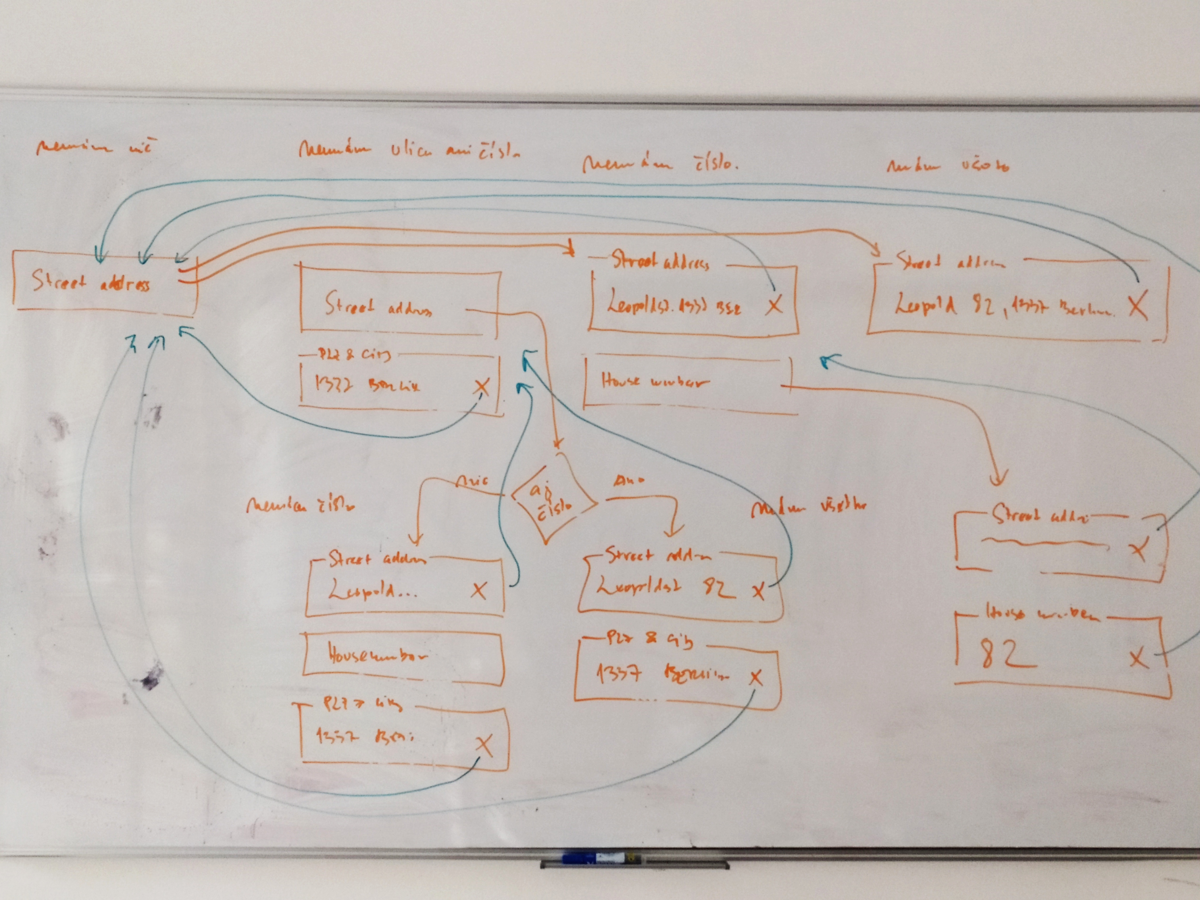
Whiteboarding and Wireframes
We used Whiteboarding to solve problems. This whiteboarding session illustrates the optimization of address entry in Germany. The diagram visualizes different address input scenarios, handling missing data (street, house number) and error resolution.
Key aspects:
- Identifying issues – Handling variations in address input (with/without house numbers, incomplete data)
- Visual data organization – Arrows depict relationships, structuring data flow
- Efficiency focus – Optimizing input validation and potential auto-completion for accuracy
This is a great example of how whiteboarding helps streamline complex data entry processes in databases or software.
My next task was creating wireframes for the purpose of rapid visualisation and design iteration, allowing me to explore ideas, communicate and collaborate with stakeholders to refine user interfaces before committing to a final design.

Design Library
To maintain consistency and efficiency in the design process, I established a robust design system and component library for the mobile app. The design system serves as a comprehensive guide, documenting all visual and interaction patterns, typography, colors, and iconography used throughout the app.
The colours, logo and font styling we used followed Kurando's design guideline.

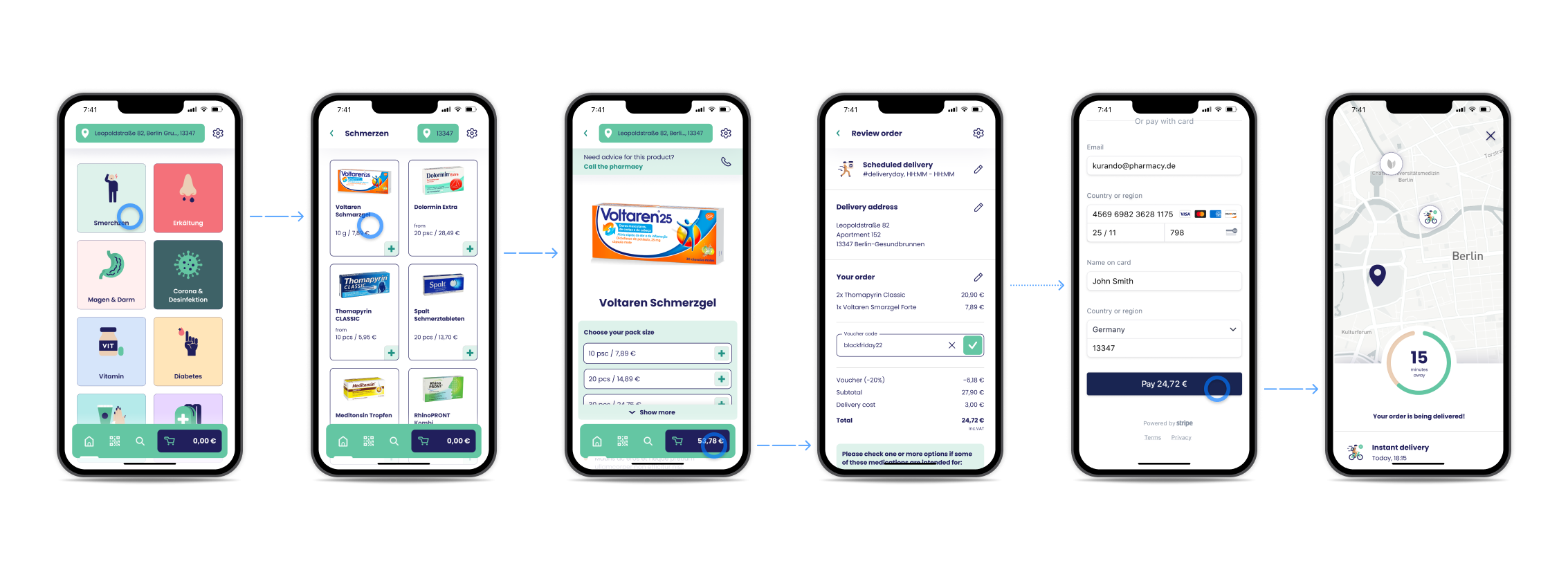
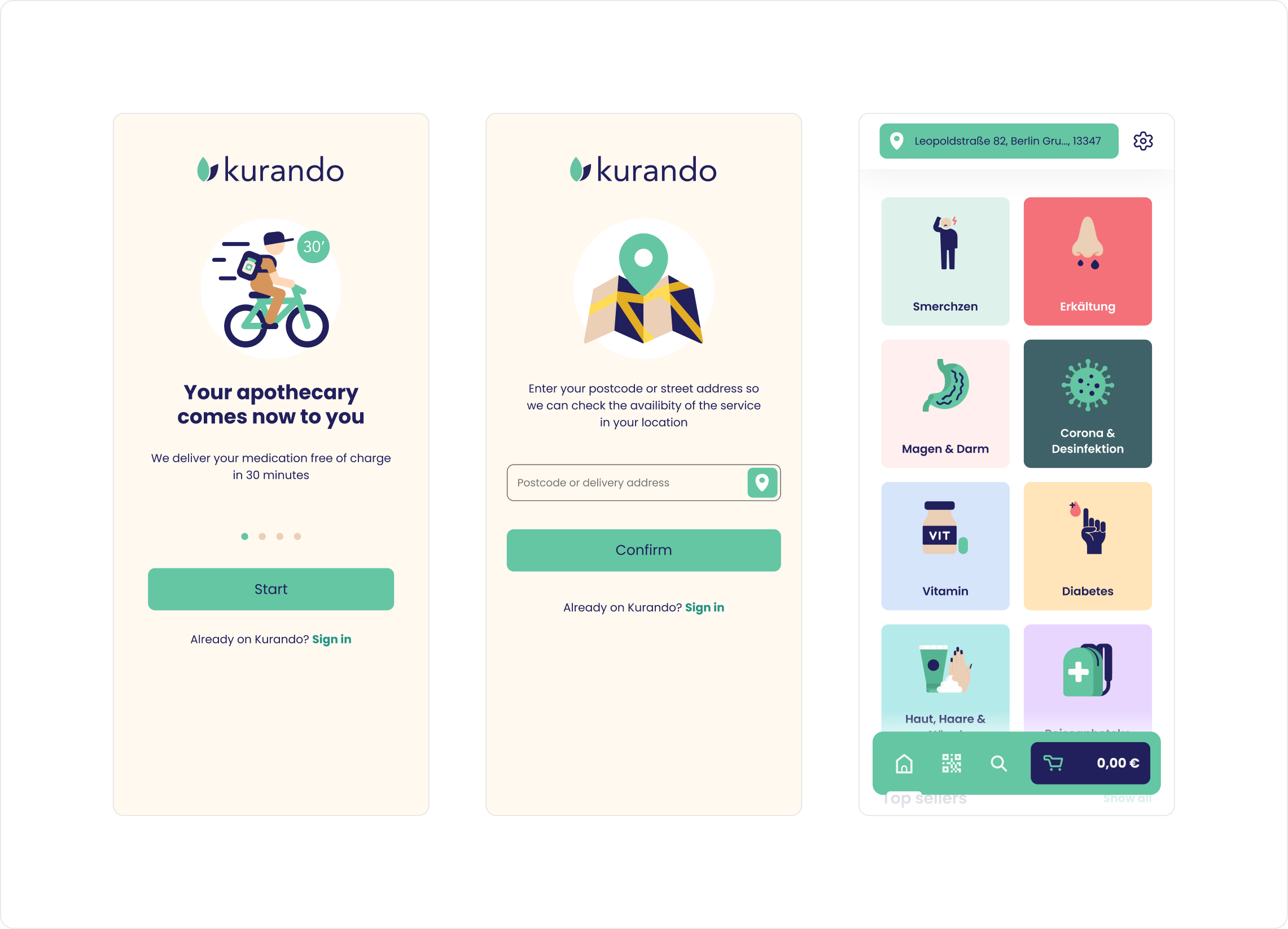
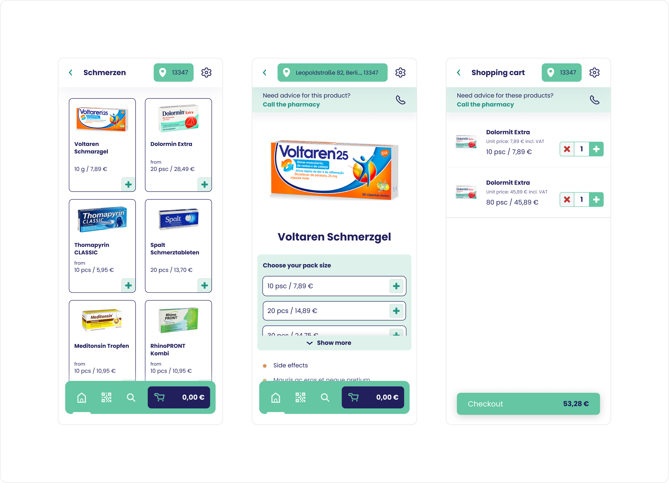
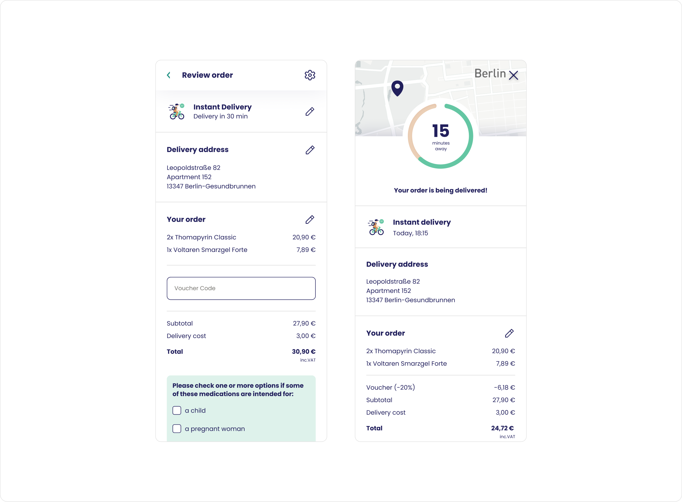
User Interface Design
I created a modern and clear user interface for Kurando, optimized for mobile devices with an emphasis on simplicity and efficiency. I used brand colors with green accents to visually support important actions. Navigation is intuitive, with a bottom bar allowing quick access to key features. I've split the ordering process into clear steps, ensuring a smooth buying process and minimizing complexity. The typography is simple and easy to read, while the CTA elements are clearly differentiated for easy interaction. I designed the design to be accessible to a wide range of users.
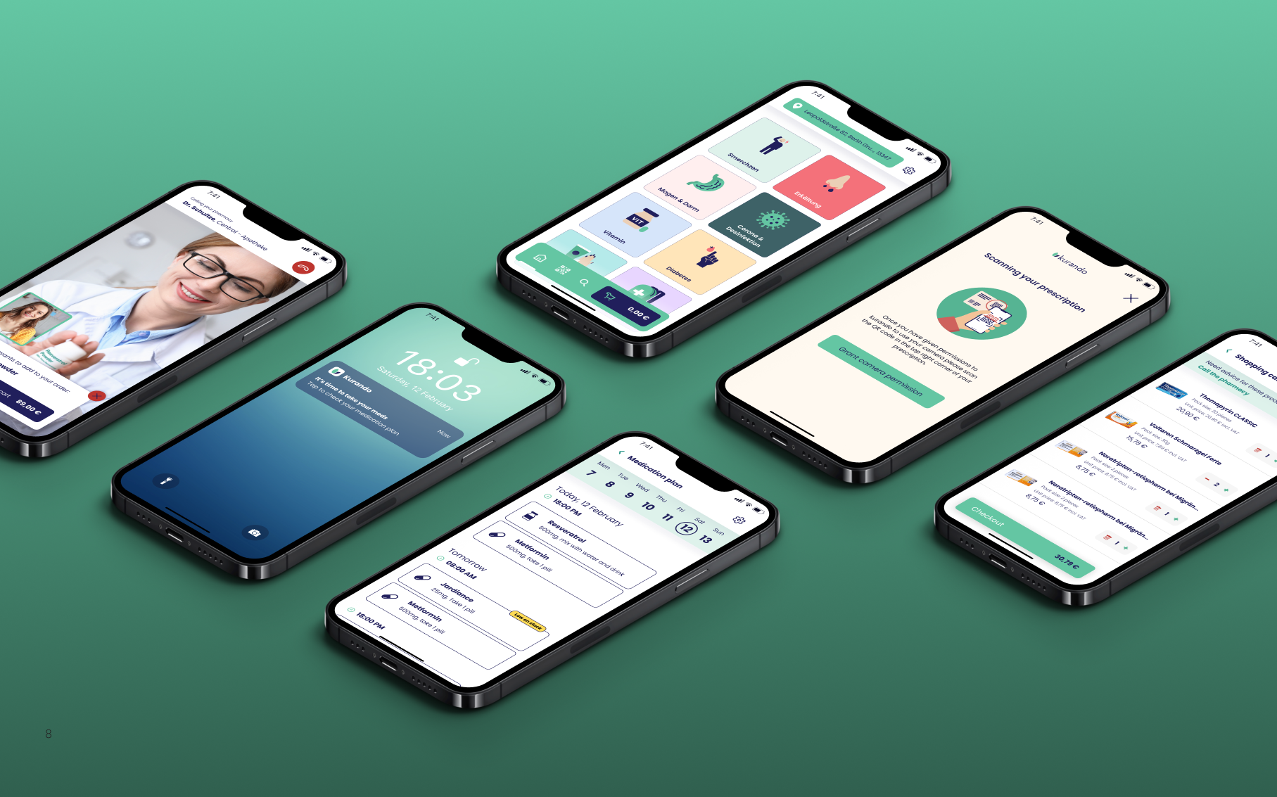
Prototype
In the end, I created a fully functional prototype that accurately simulated the final product. This prototype allowed me to test the user experience and get valuable feedback from real users. It helped us validate the navigation, the efficiency of the ordering process and the intuitiveness of the entire interface. This allowed us to optimize the details before development and ensure that the final version of the app was as responsive as possible to users' needs. The prototype also provided the development team with a clear visual and functional reference, minimising the risk of incorrect implementation.