Redesign of the travel insurance sales funnel
Union poisťovňa, s.r.o.
Service
Overview
The goal of the project was to improve conversion and funnel flow for travel insurance sales. Data analysis revealed significant drop-offs at key steps in the purchasing process. The project focused on identifying user problems, validating hypotheses through research, and designing an optimized UX solution.
Problem 💡
Travel insurance was sold through a multi-step online funnel. Despite stable traffic, there was a problem with high bounce rates at some steps, resulting in a lower purchase completion rate.
Key questions of the project:
- Which steps cause the most friction?
- Why do users leave the funnel?
- How can we simplify user decision-making?
Proces
Analysis of the existing funnel
At the beginning, I analyzed user behavior using:
- Microsoft Clarity – session recordings and heat maps
- Google Analytics – analysis of drop-off points in the funnel
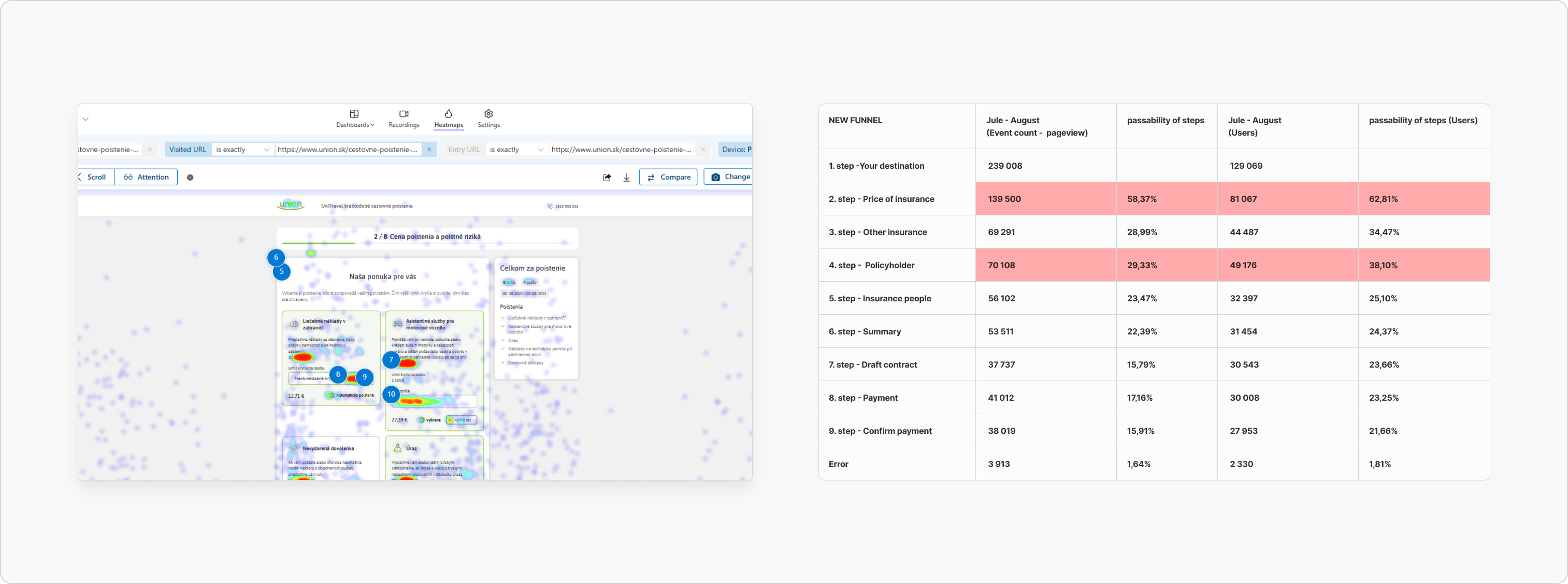
Key findings
I identified several problems:
- users did not understand the differences between insurance products
- too complex and long decision-making in insurance products
- unclear information structure
- unnecessary friction in some steps of the form
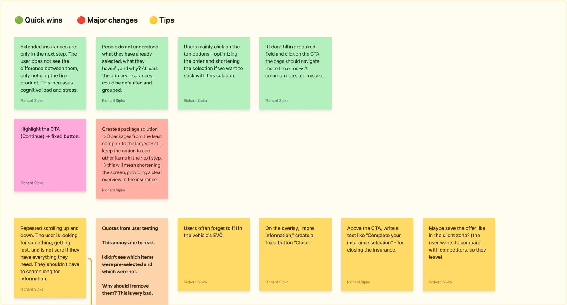
Usability Testing
To confirm the hypotheses, I organized usability testing.
Testing goals:
- understand user decision-making
- identify moments of uncertainty
- compare problems from analytical data
Biggest pain points
Users had particular problems with:
- understanding the difference between types of insurance
- deciding between several options at once
- navigating certain steps in the funnel
Problem Solution
Based on my research, I proposed two alternative approaches.
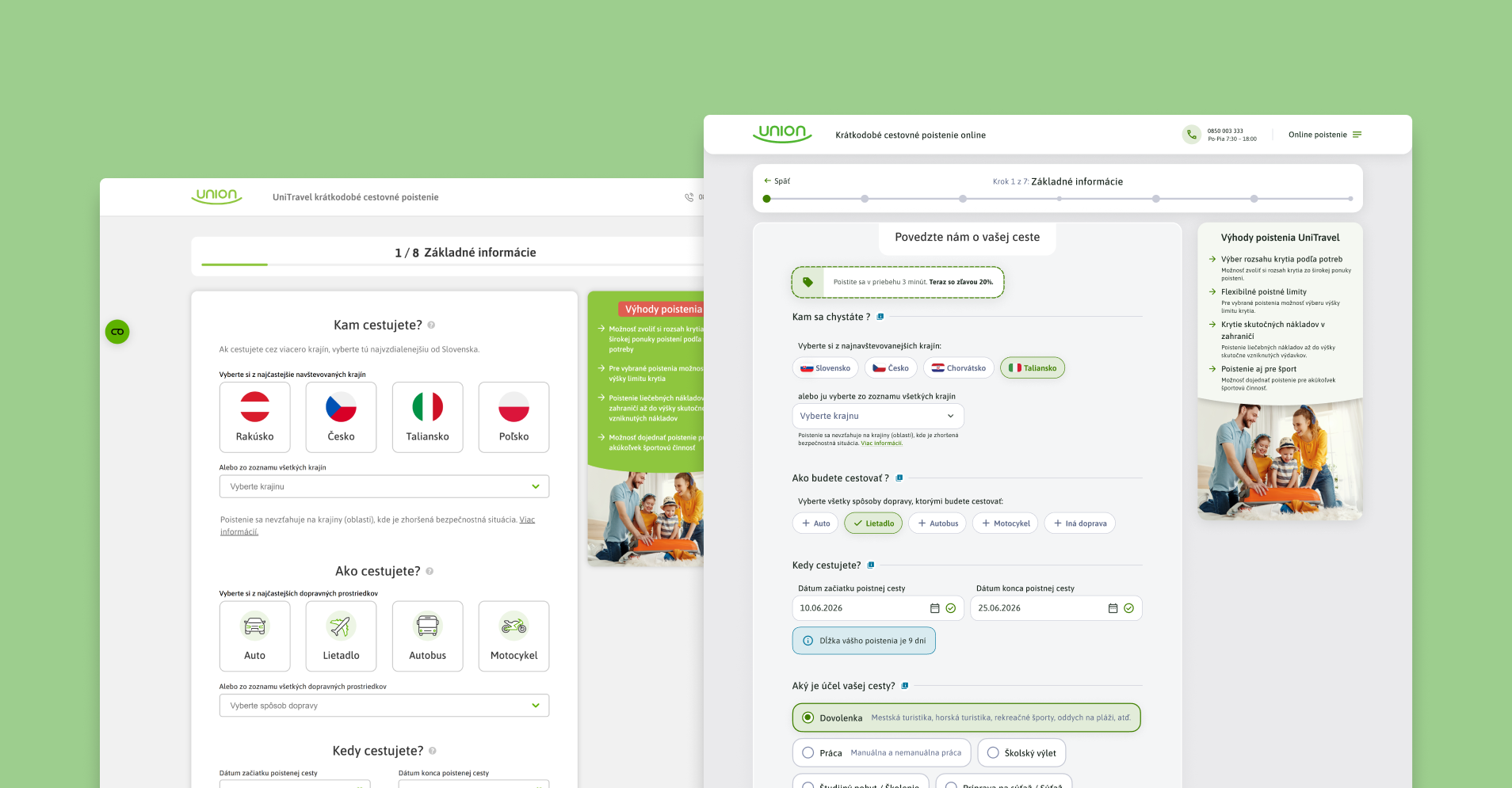
1️⃣ Package solution
The user chooses from prepared insurance packages.
Assumption:
- easier decision-making
- faster decision-making and selection
- reduced cognitive load
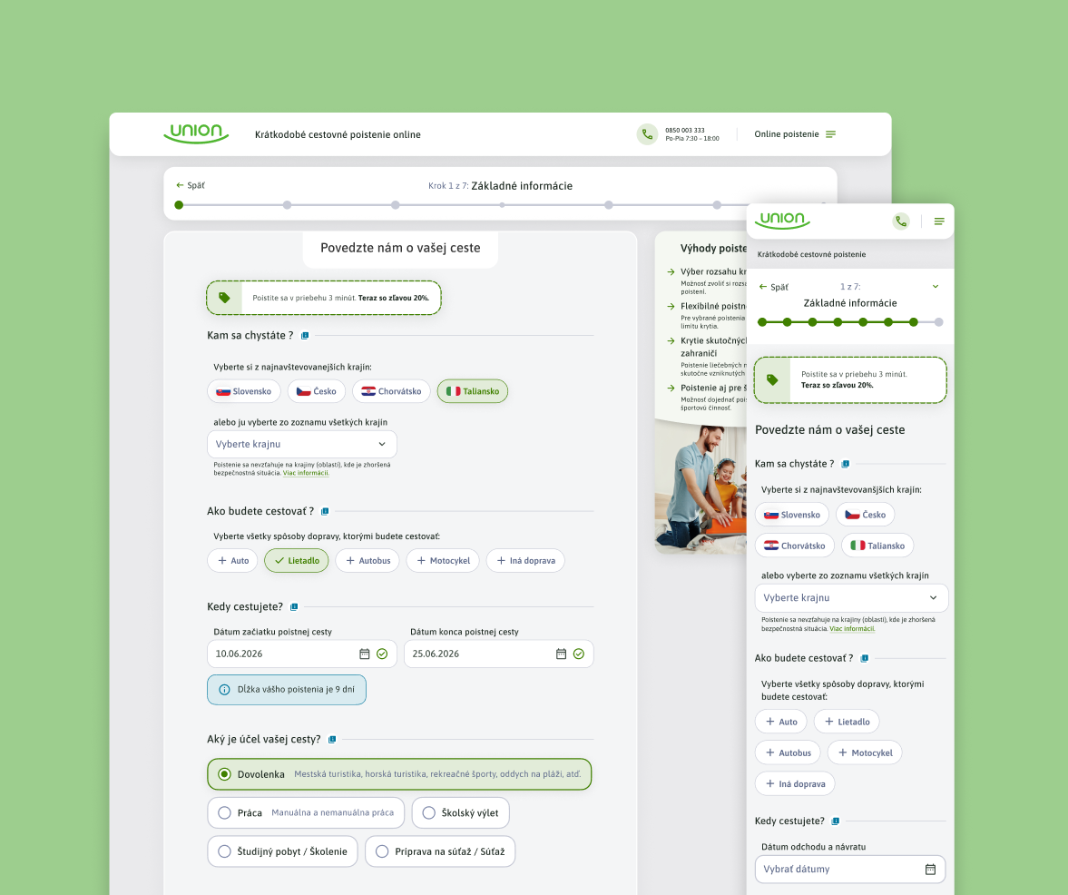
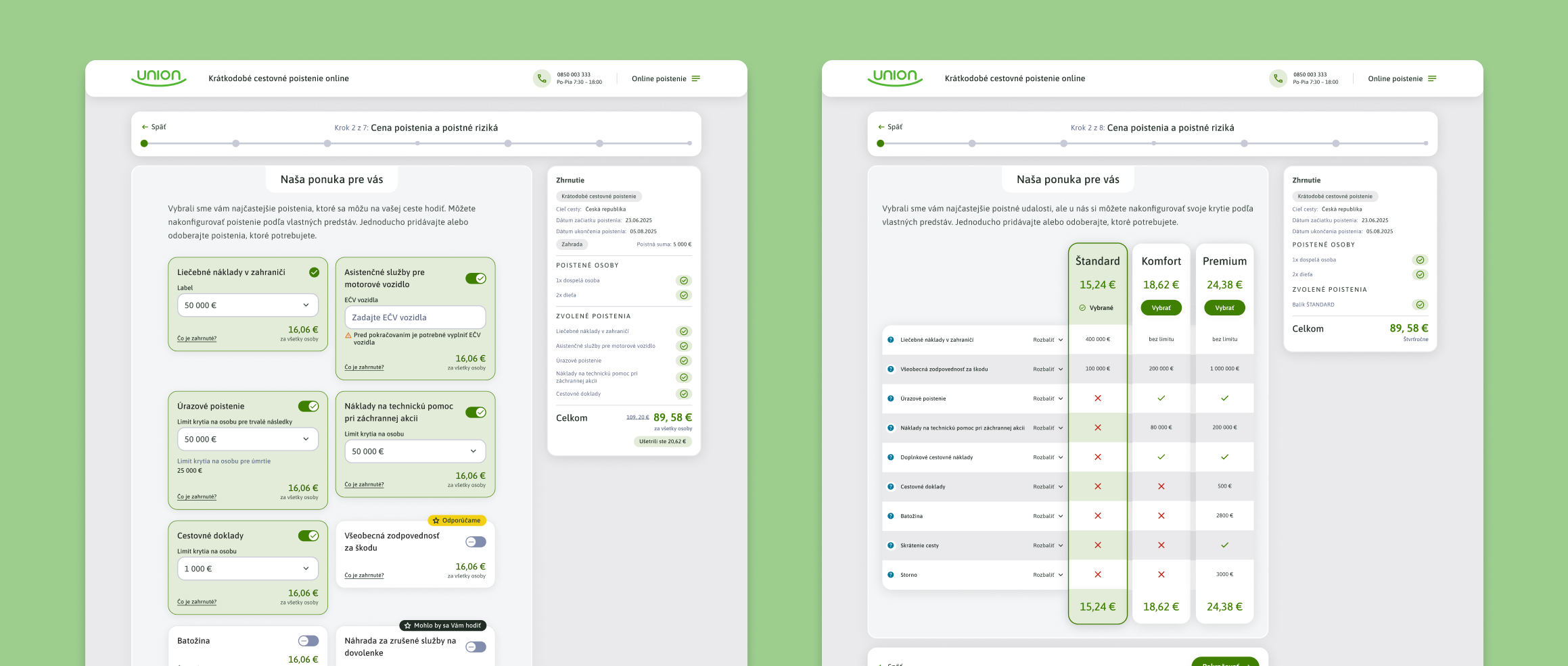
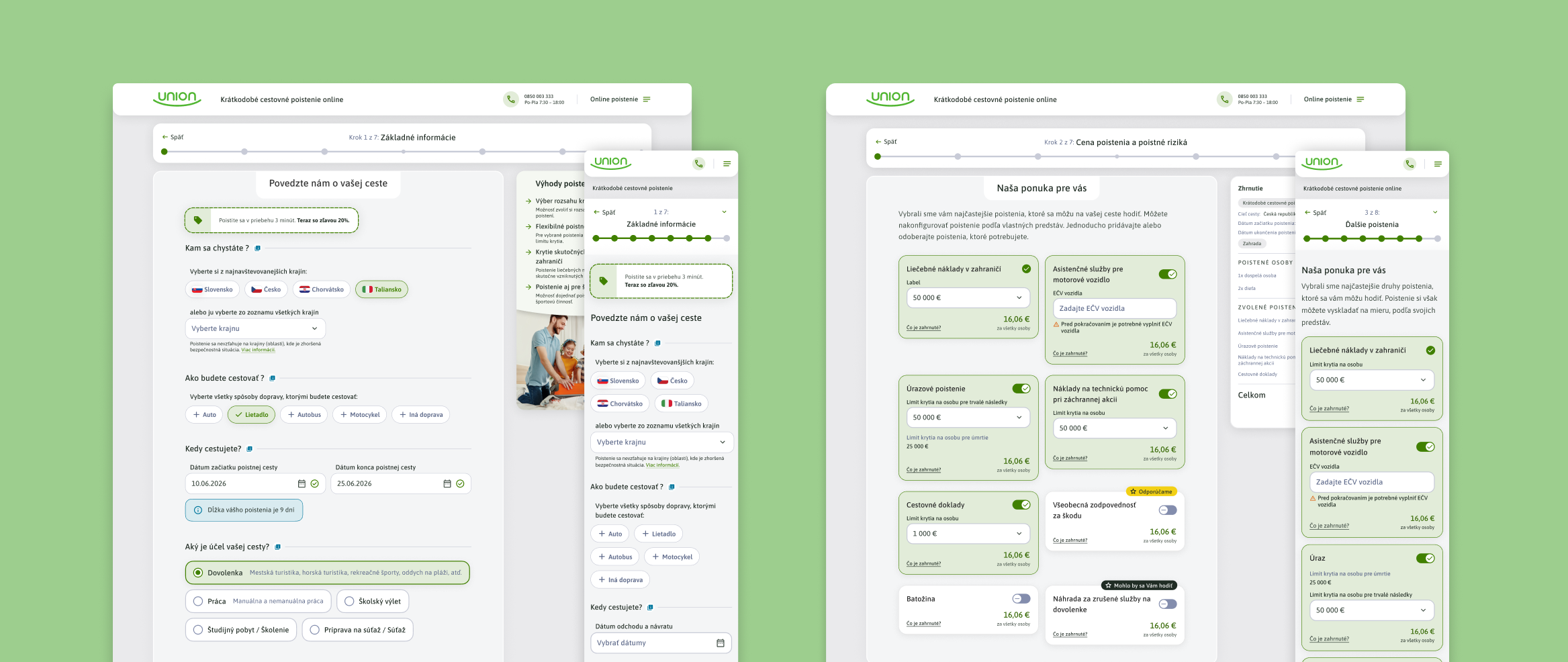
2️⃣ Optimized existing model
Retaining the existing approach, but with significant UX improvements:
- better information hierarchy
- clearer explanation of insurance
- simplification of steps
- reduced cognitive load
- better visual separation between active and inactive insurance cards
Prototyping
For both solutions, I created functional prototypes using IA vibe-coding, which simulated the real behavior of the funnel.
This approach enabled:
- more realistic testing
- better understanding of interactions
- rapid iteration of designs
Usability testing and validation
I then performed usability testing on the prototypes again.
Before testing, we assumed that the package solution would be easier for users to understand and faster. However, testing showed that this was not the case at all; quite the contrary. The existing solution with UX changes proved to be more effective, and the time spent on this step was very similar.
Testing has shown:
- better understanding of the offer was in optimized existing model
- faster decision was equal in both design models

Final result
Main outcome of the project was:
- Optimized UX of the existing sales funnel
- simplified insurance selection process on the step 2
- remove step 3 that people ignored
- clearer presentation of products
- remove family discount and applied general discount 20%
The project showed that a combination of data analysis, user research, and iterative design is key to optimizing conversion funnels. By identifying critical pain points and simplifying user decision-making, we were able to design a clearer and more intuitive travel insurance purchasing process.
The result was an optimized funnel that reduces the cognitive load on users and promotes smoother purchase completion.
What I would do next
- A/B test of packaged vs. optimized solution
- tracking conversions for each step of the funnel
- further optimization based on behavioral data