Law Firm Management App
Company
Service

About
Advocatus Digital is a mobile application designed for law firms to help them efficiently manage legal services and clients. Throughout the project, I worked closely with the client, ensuring a functional and visually appealing design through continuous iterations.
Process
Gathering Requirements and Client Collaboration
The design process started with extensive communication with the client, who provided a list of required features for the app.
We held discussions to clarify priorities, ensuring alignment with business goals. Researching industry standards, I proposed solutions. This iterative collaboration allowed us to refine ideas before desinging, ensuring each feature had a clear purpose and contributed to an intuitive user experience.
Creating Design Library
To ensure consistency and streamline future development, I built a comprehensive design library in Figma. This library included:
- Components for various UI elements.
- Style guidelines such as colors, typography, and layouts.
- Reusable screen templates.
Iterative Design and Approval
- For each screen, I designed and refined layouts based on the client's needs.
- In some cases, I created new screens to improve usability and efficiency.
- After presenting the designs, client feedback led to multiple iterations, enhancing clarity and functionality for a better user experience

Feedback from testing
Since the client was also responsible for programming the app, they provided valuable feedback based on real-world testing. Having access to the test version allowed me to:
- Observe how the app functioned in real-time.
- Identify and fix UX/UI issues.
- Adjust the design to better meet user needs.
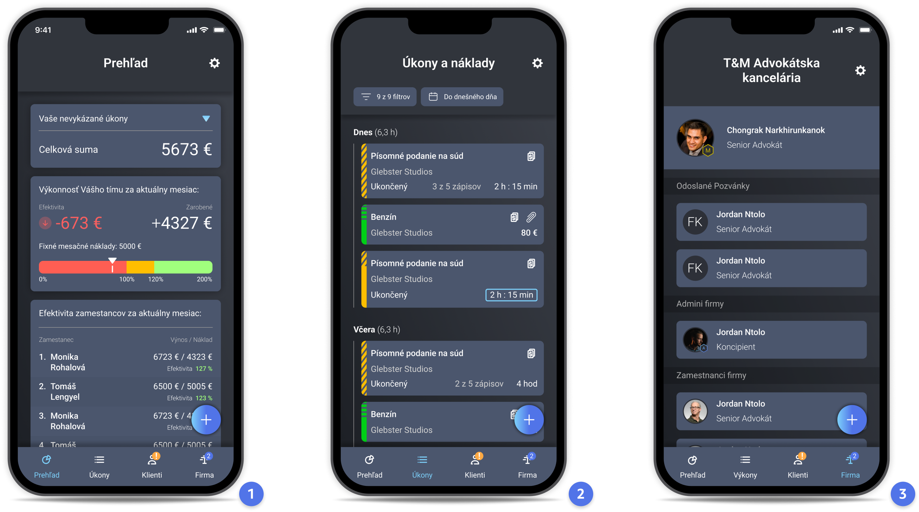
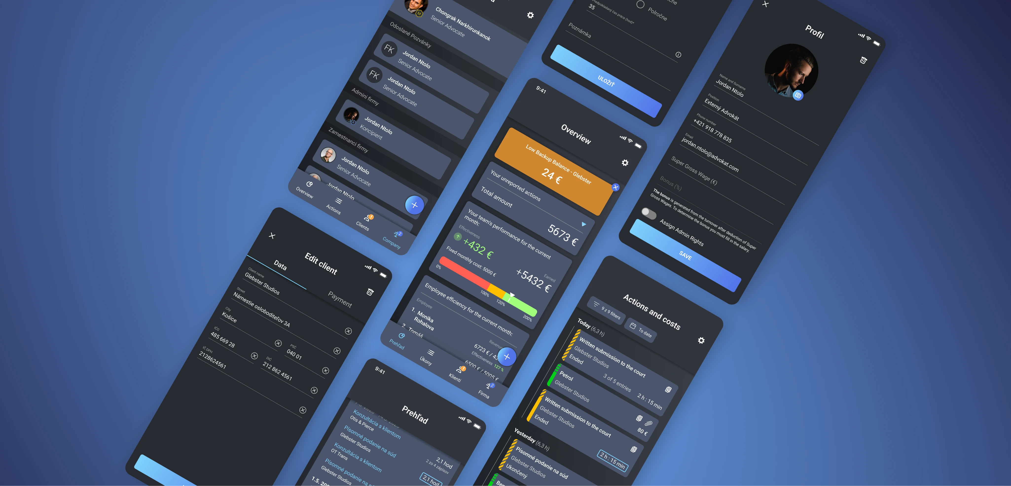
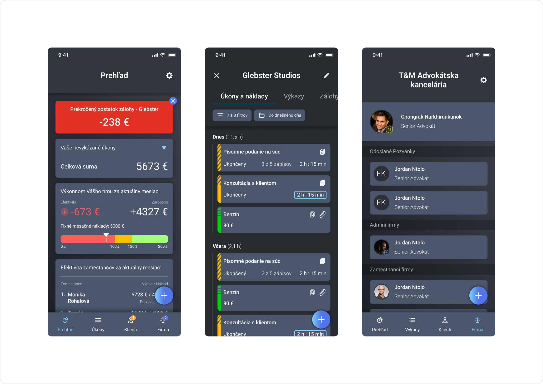
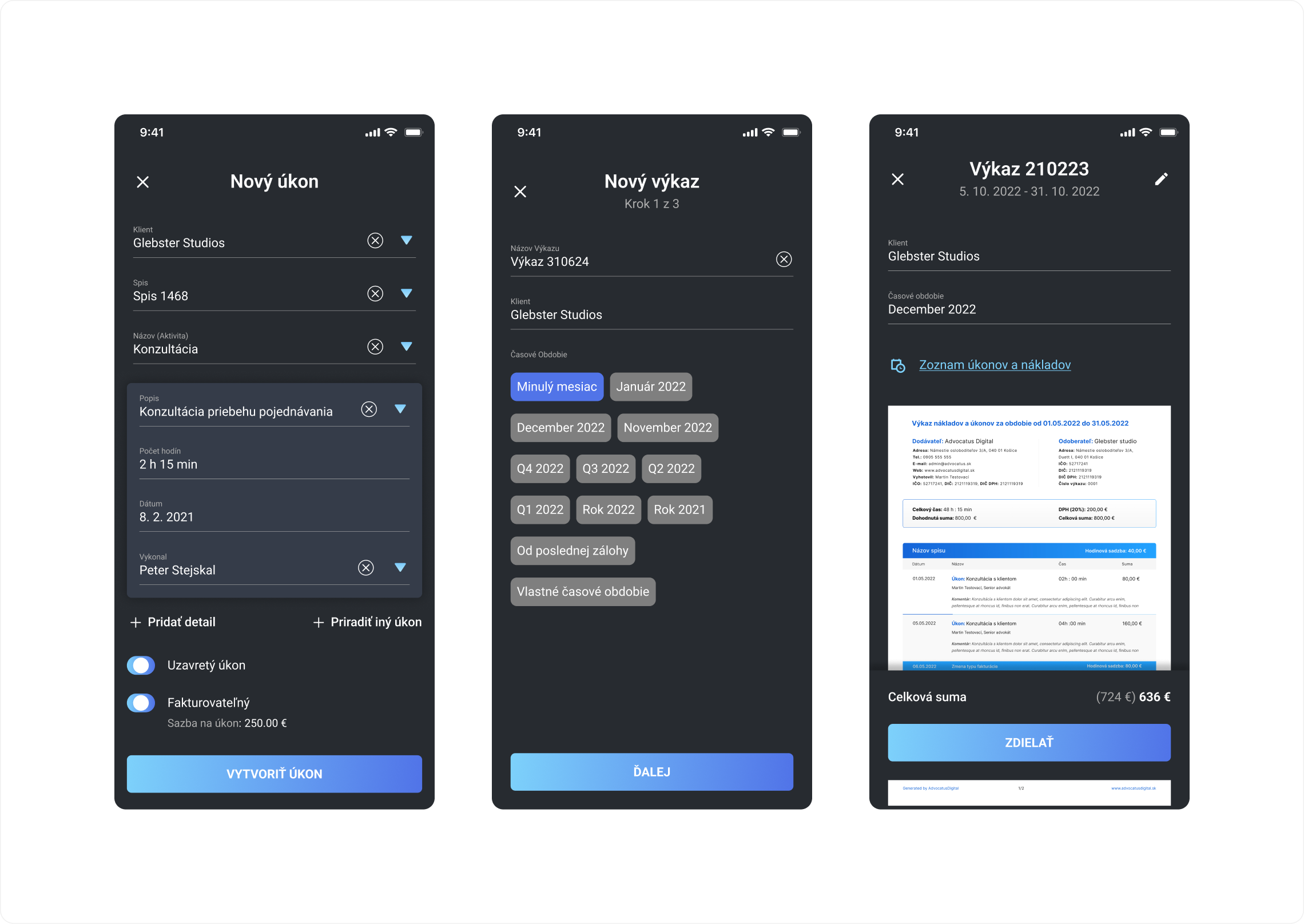
1. The first screen shows us what the admin dashboard looks like. On the first widget from the top admin sees activities that are not yet completed. On the second widget he sees the efficiency of the company which is calculated from the entered monthly costs and the bottom widget shows the efficiency of the employees according to their gross salary
2. The second screen shows an overview of all activities in the company, the individual colours on the side of the widget show the type of activity and the icons in the top right corner indicate whether the activity has been invoiced or contains attachment
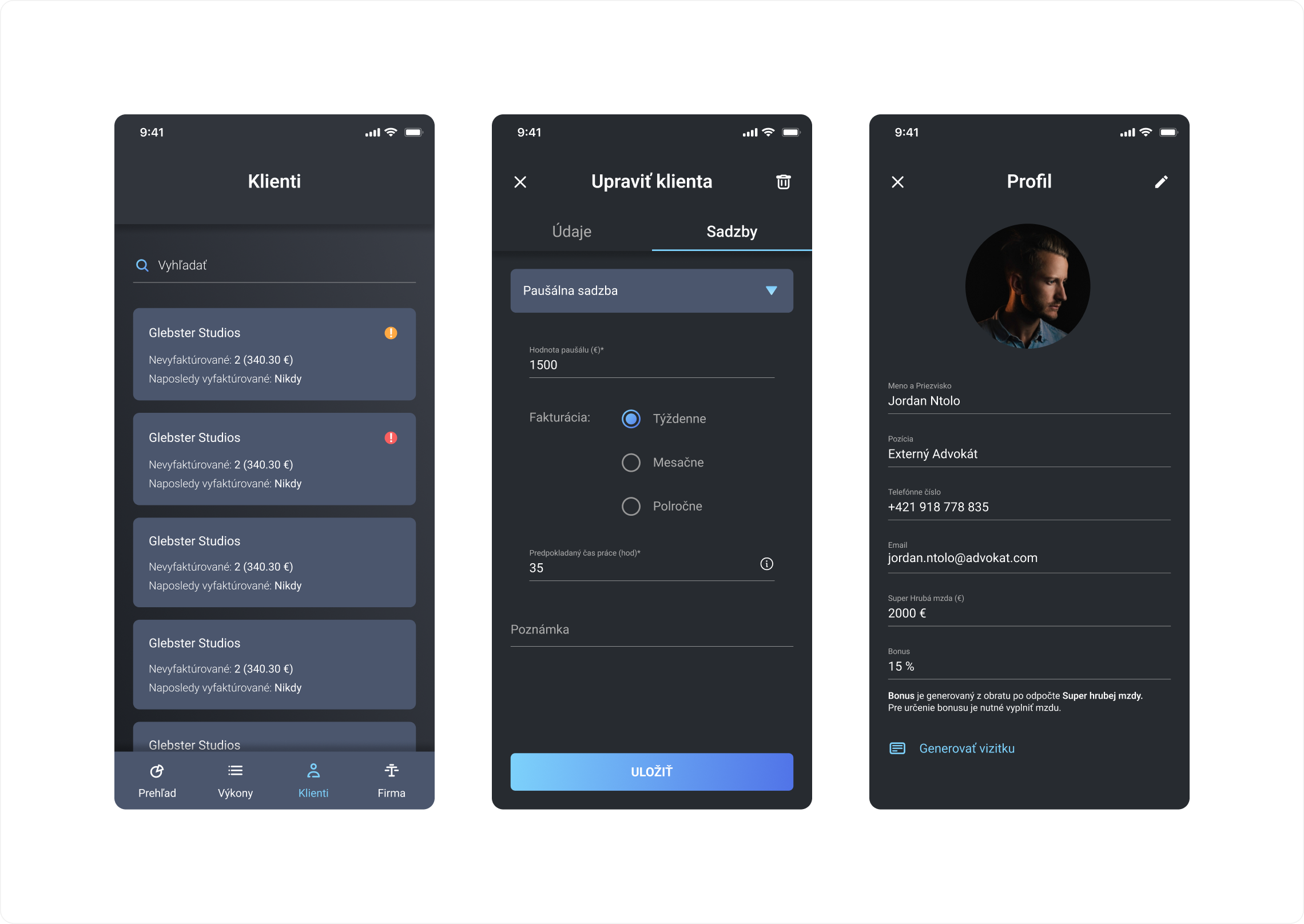
3. the third screen shows the management of the company, in this section the admin can add, remove employees, give them admin rights and edit their profile
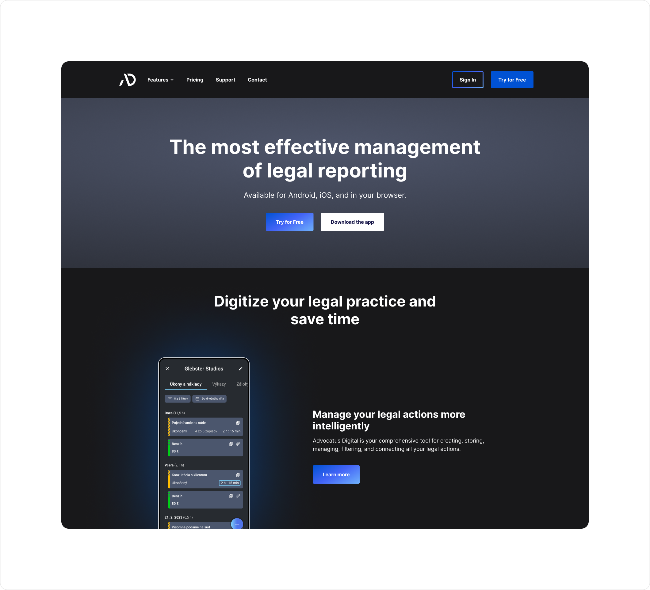
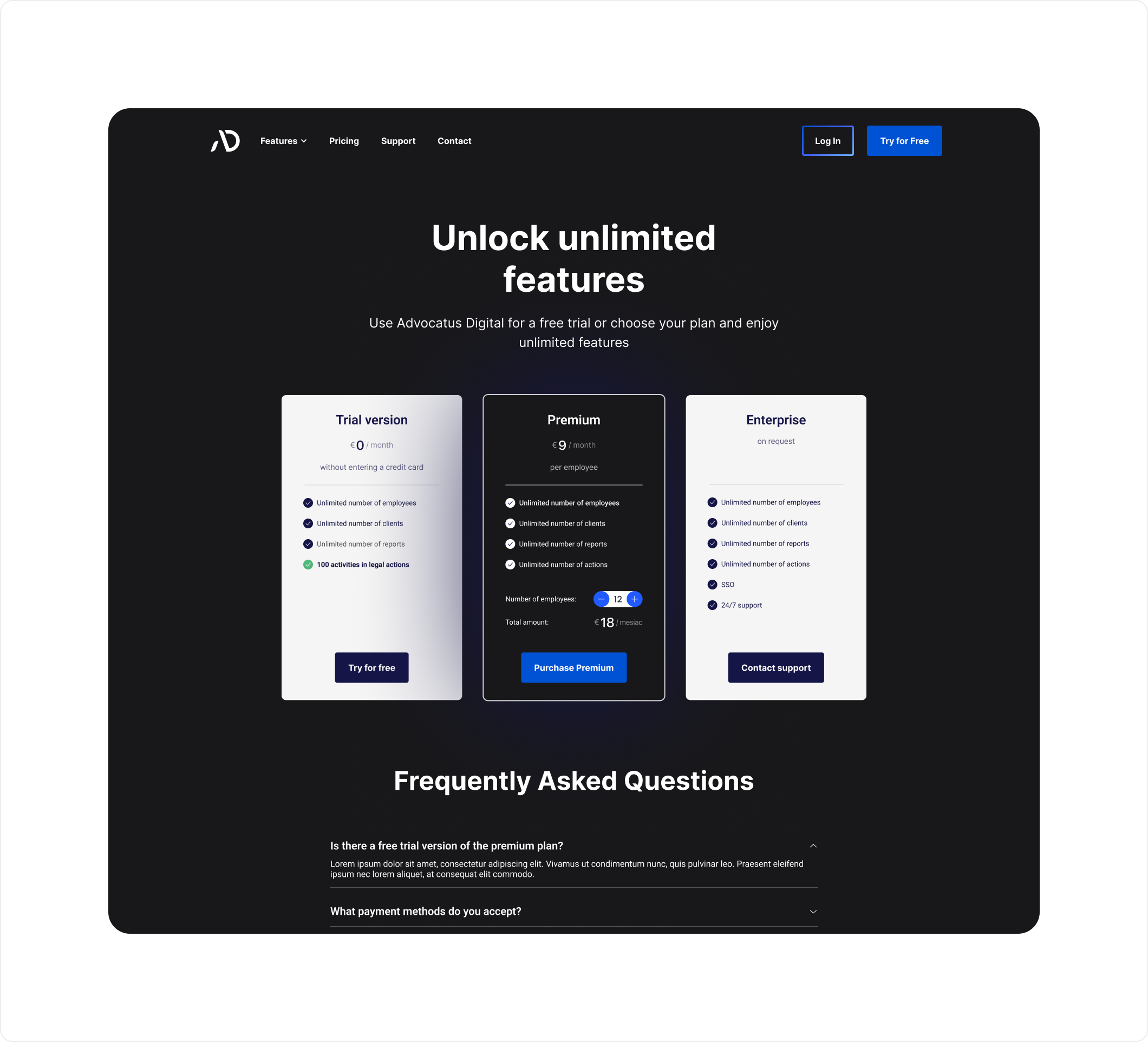
Building the Presentation Website
The final phase of the project involved designing a website to present the app, enable downloads, and manage subscriptions. The process included:
- Structuring the information architecture with original content.
- Crafting the UX design for intuitive navigation.
- Developing the UI design in alignment with the app’s visual identity.